Dawn Yoga
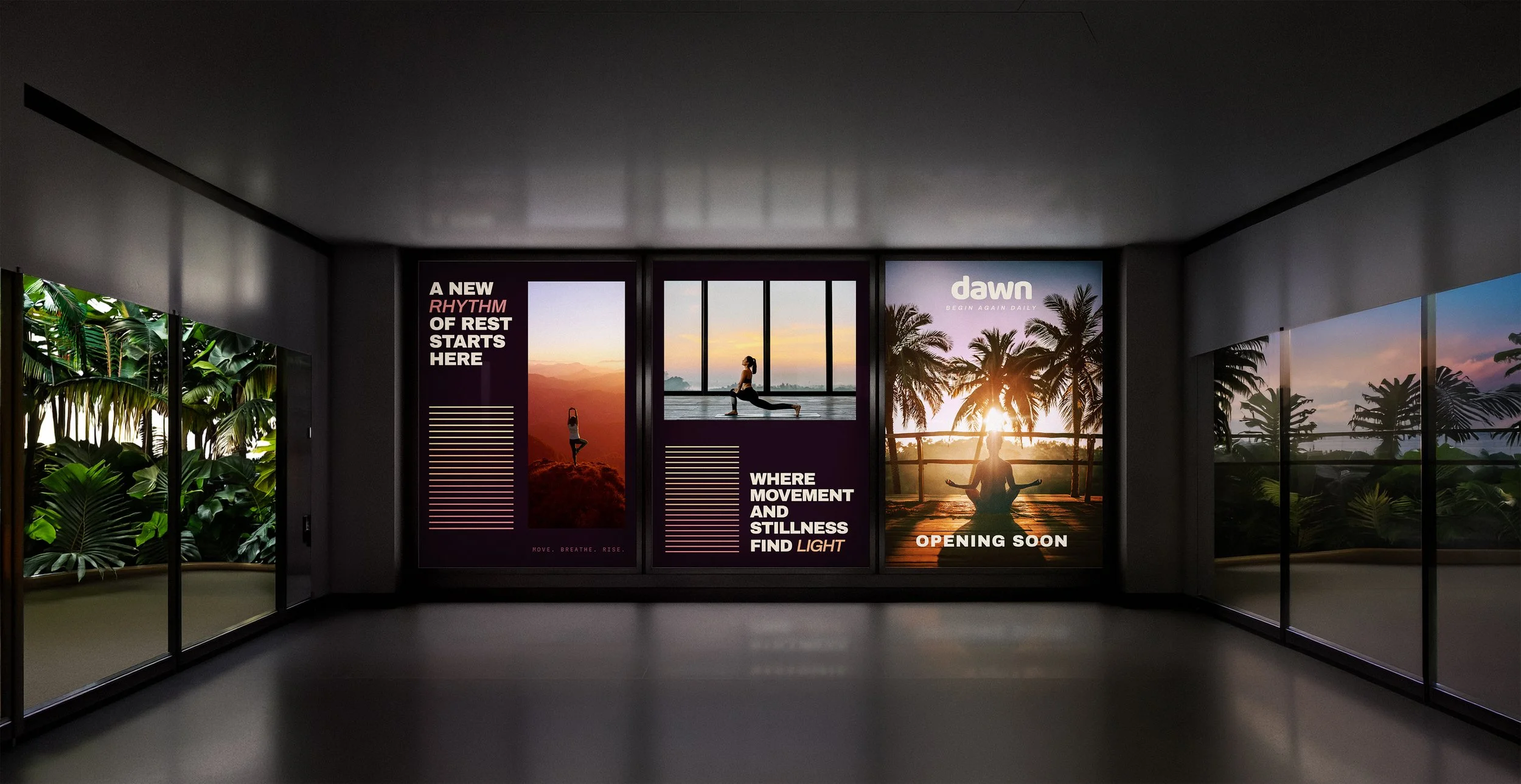
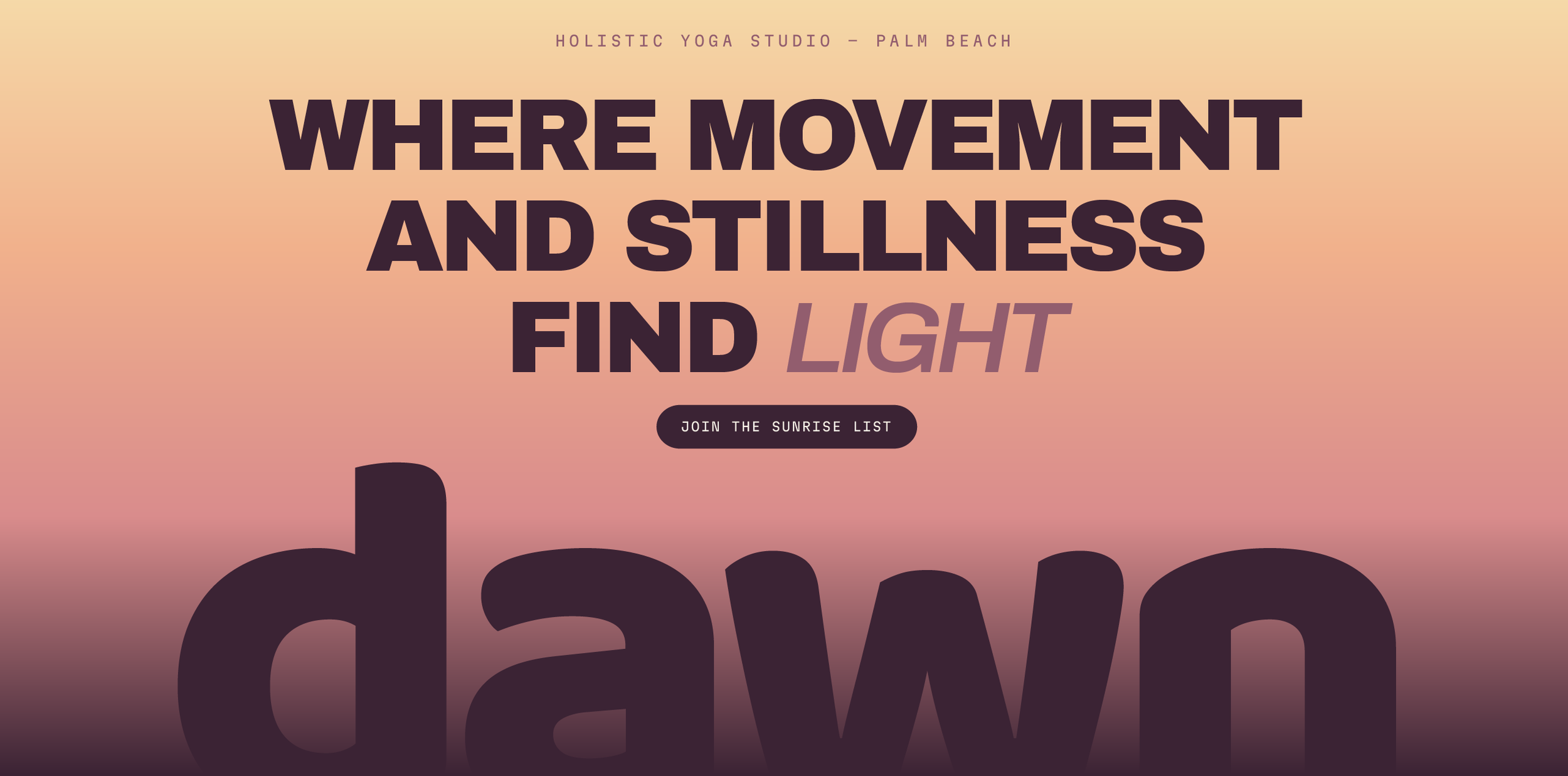
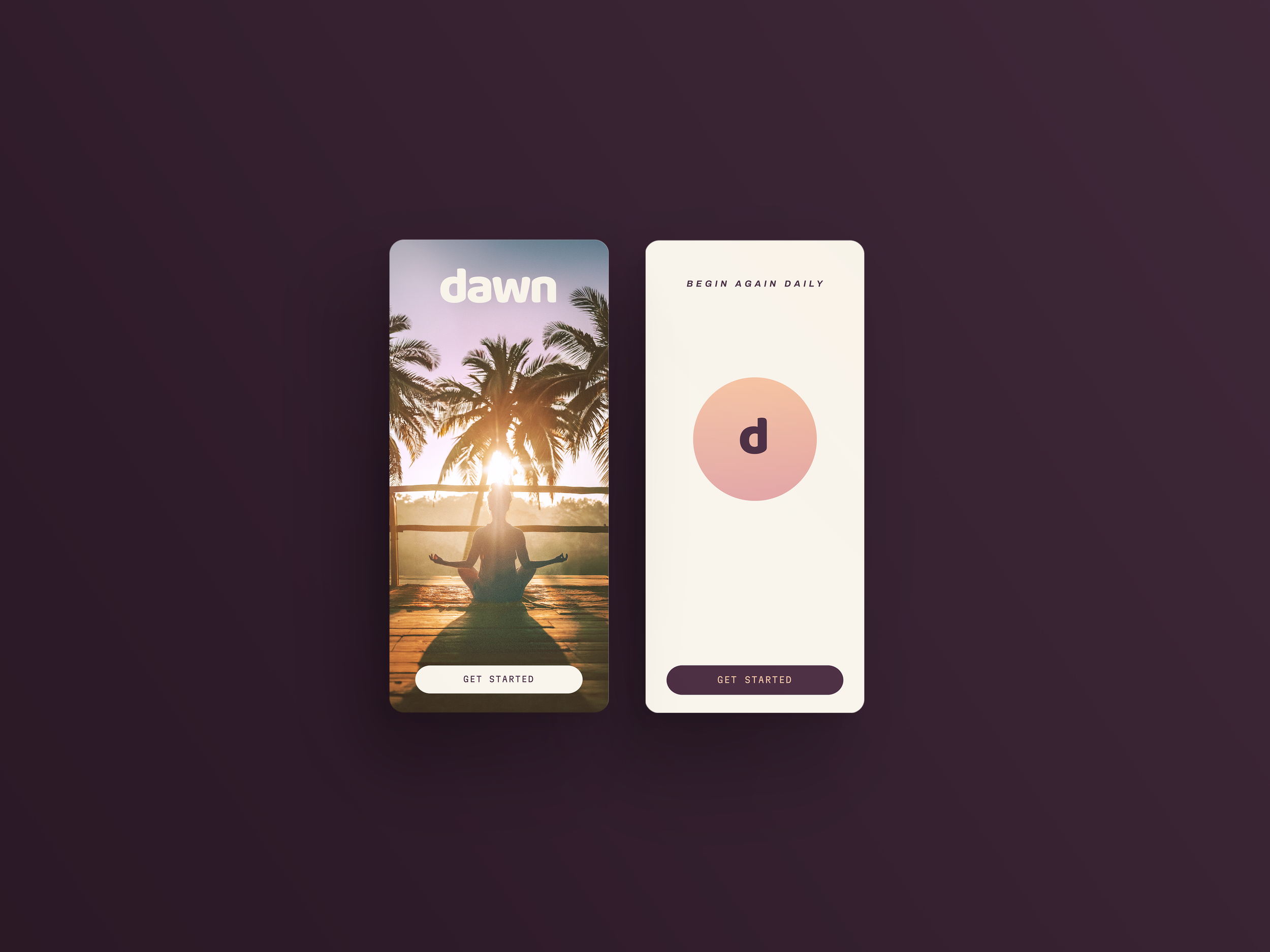
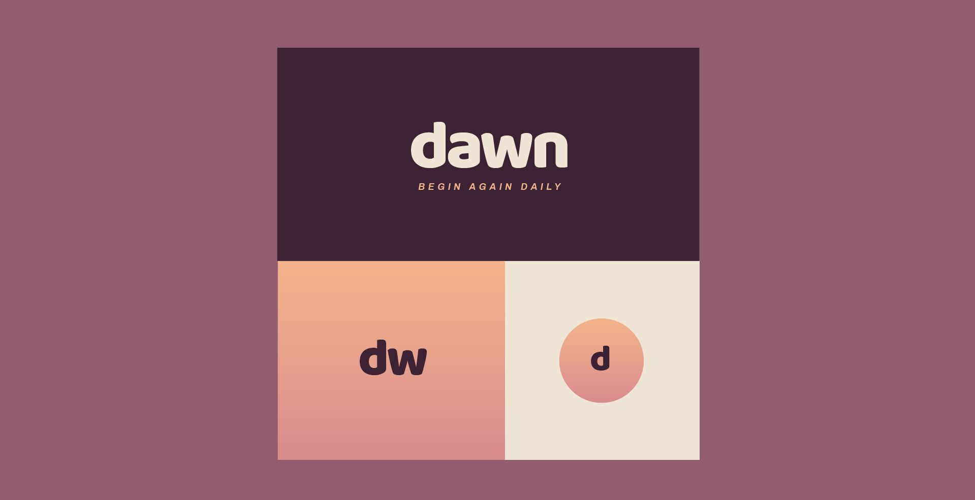
A holistic yoga studio built for the first hours of the day. Rooted in the belief that stillness is where strength begins, the identity borrows the quiet gradient of early morning; blush, apricot and pale gold over deep plum in a warm, contemporary, minimal system.
Sector: Boutique Wellness & Yoga Studio.
Vision: Making stillness the first ritual of the day.
Role: Identity Designer.
Services: Concept, Identity Design, Typography, Colour System.
Impact: Positioning early morning practice as a considered, premium wellness ritual.

Brief
The studio asked for an identity that could hold the same quiet the studio is built around: the hour before the world wakes, when stillness feels less like rest and more like readiness. The challenge was to move past the cool, clinical whites and greenery clichés of typical yoga branding, and build something warmer, a system that felt like first light rather than a fitness studio.
Design
I designed the Dawn identity around the exact gradient of early morning itself, blush dissolving into apricot, apricot settling into pale gold, gold deepening into plum. This palette became the spine of the system, extending across a warm, minimal framework of soft type, generous space and a restrained brandmark. The result sits closer to a considered ritual object than a studio logo, a brand that feels less like it's announcing a class schedule, and more like it's holding open a moment of quiet before the day begins.