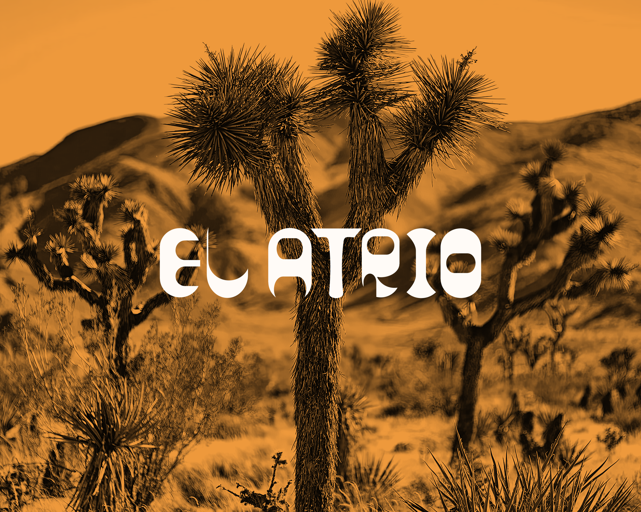
El Atrio
Turning the bee’s precision and the fighter’s spirit into a modern Mexican craft beer identity for the Australian market.
Sector: Craft Beverage & Mexican Culture.
Vision: Elevating shared moments with bold geometry and cultural resonance.
Role: Creative Partner, Visual Strategist, Identity Designer
Services: Brand Naming, Art Direction, Identity Design, Packaging Design.
Impact: Translating Mexican fighter iconography and bee symbolism into a contemporary, collectible beer brand.
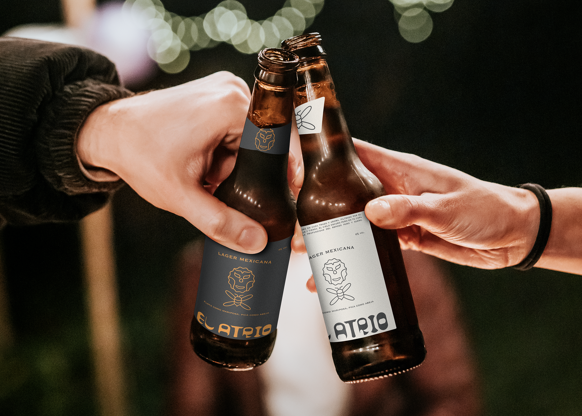
Brief
I was invited to explore concepts for a craft lager. The brief encouraged a fresh injection of cultural energy, aiming for an identity that feels both rooted in tradition and unmistakably contemporary, positioning the brand as a vibrant cross‑over for design‑forward bars and discerning drinkers.
Design
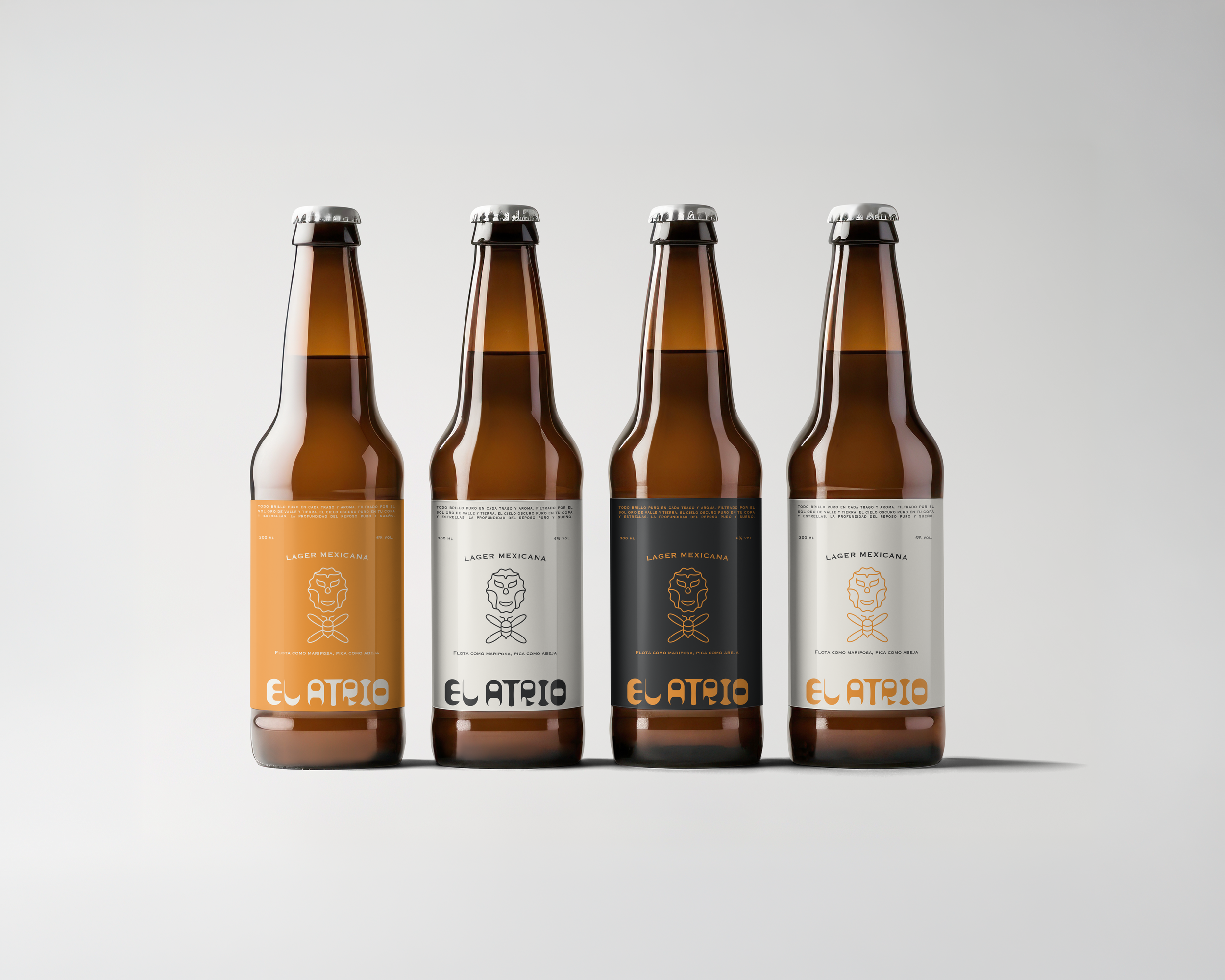
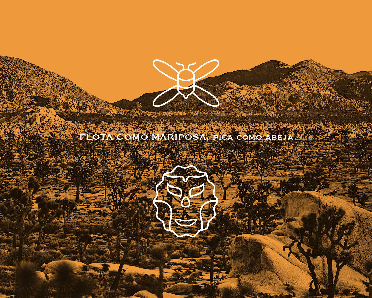
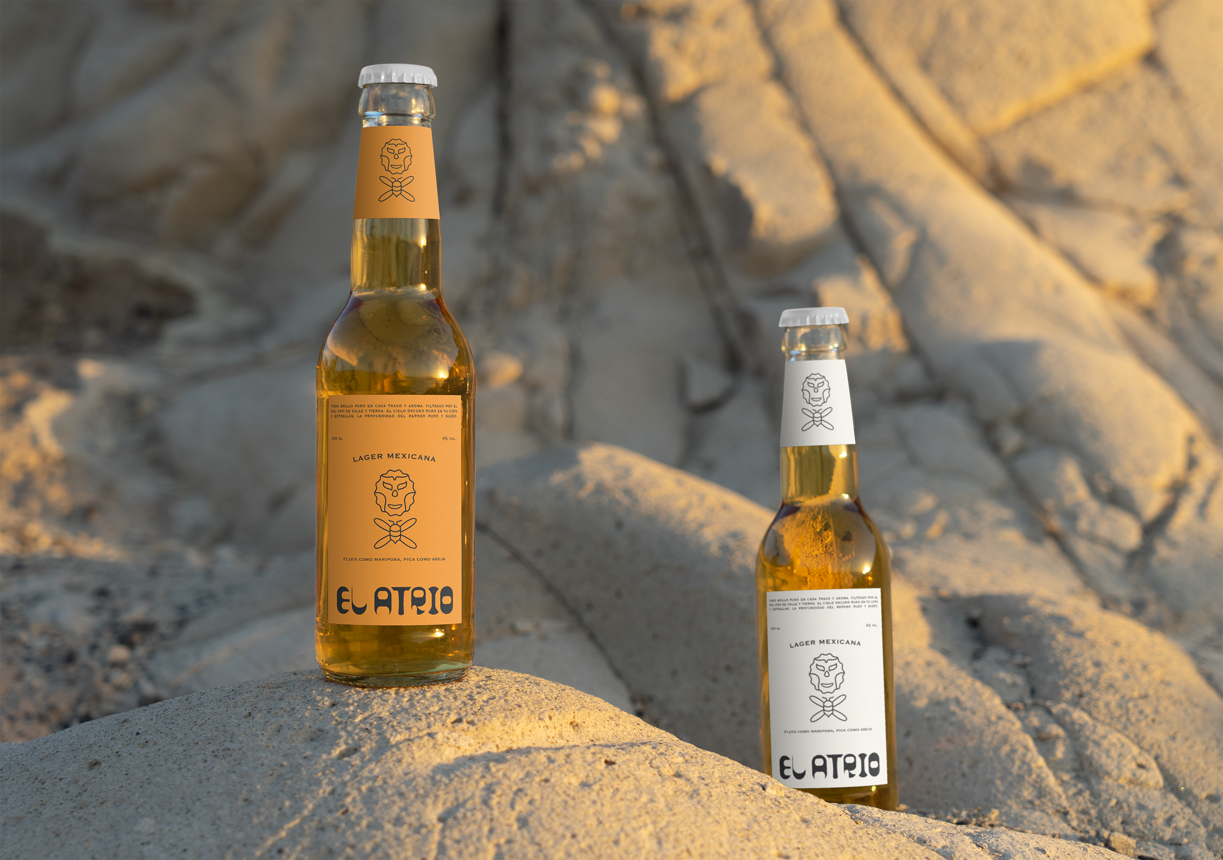
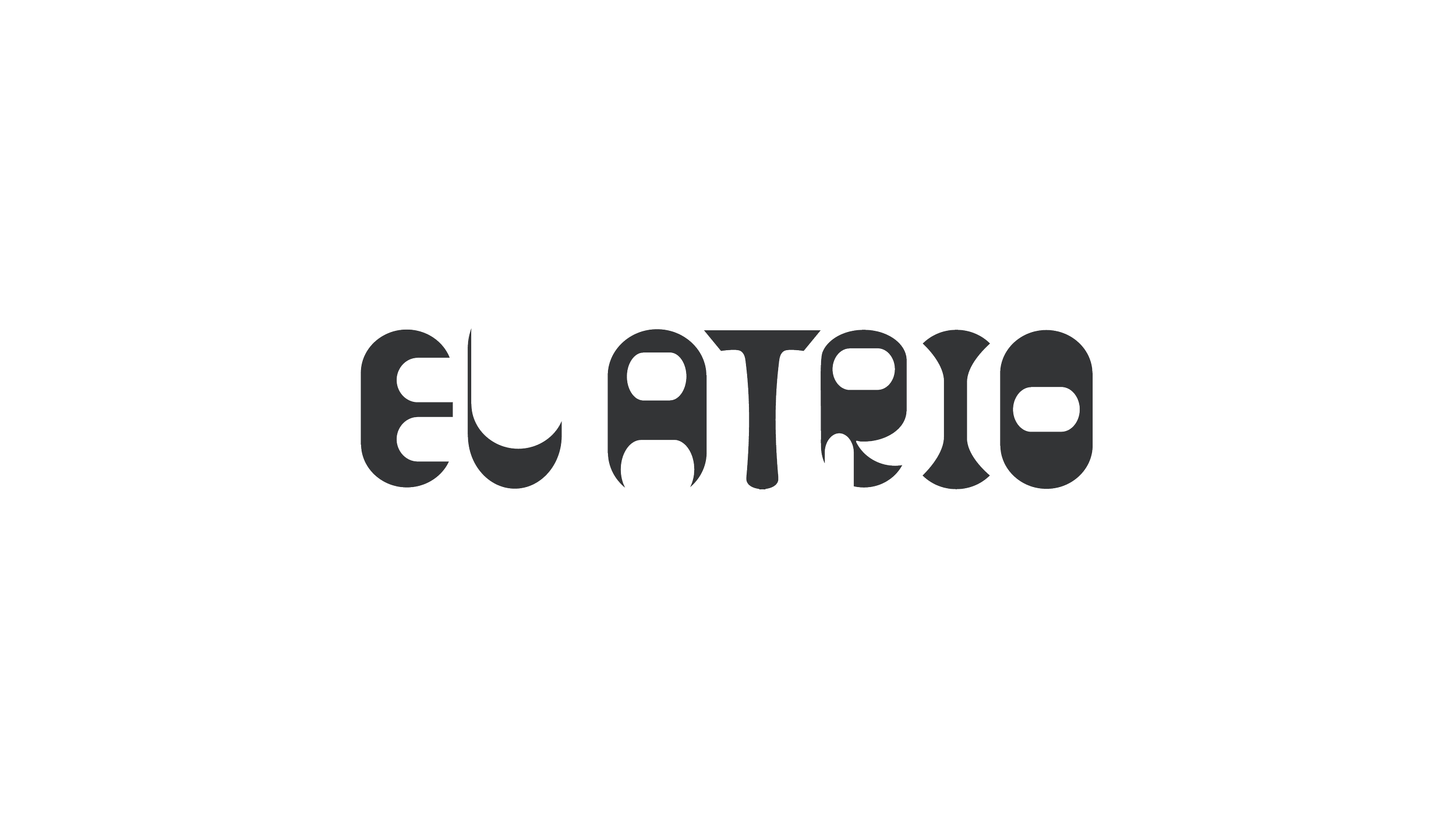
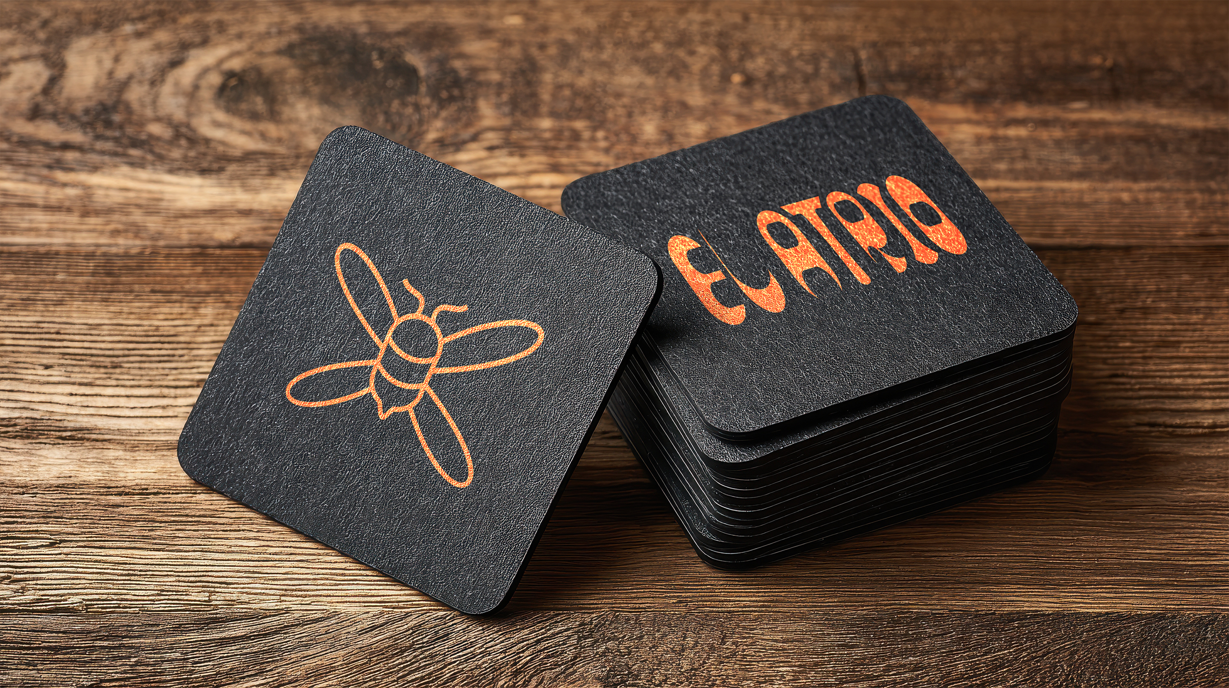
I took a Mexican lens, drawing on the idea of the atrio, a communal gathering space to shape El Atrio’s identity, where the bee’s geometric precision meets the luchador’s expressive spirit. The name is set in bespoke typography, designed to balance strength and elegance central to the concept. Guided by ‘Flota como mariposa, pica como abeja’ (a cheeky Spanish spin), I set out to capture both freedom and sting through clean lines, a restrained modernist palette, and intentional negative space, creating visual impact that feels premium yet culturally grounded. It channels Mexico’s vibrant heritage while resonating with Australian collectors and craft enthusiasts who share an independent spirit and a love of artistry and storytelling in their beer.